Posts

Showing posts from November, 2012

Visual Examples: Combining Clip art with pictures

It is been a while since I have posted new visual examples. I'm thrilled about this one: not all pieces of clip art are created equal. The guys at Yiibu have done a great job combining clip art and pictures in a very interesting presentation. Enjoy!

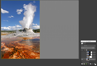
Minitutorial: Creating a title slide from a portrait image

Image
Back in January I promised I would do a tutorial on how to turn a portrait image into a full side slide. Well I can't start a series on tables without first doing that tutorial. Let's get started. The "problem" is simple, you have an image with the right height of a slide, the the width is not enough. In the case of a 1024 × 768 slide, some images come in the 512 × 768 size, so what to do with the other half? Case in point, Figure 1: Original portrait image. I would like to use this image taken from Wikimedia commons, but what to do with the other half? The result that I what to go is this Figure 2: turning Figure 1 into a full side slide With would give me white space and a sense of continuity that I really like. SO that's what we are going to do,  makeover Figure 1 into Figure 2.  The trick is simple, (1) we crop some pixels from Figure's 1 right border,  (2) stretch it to cover the rest of slide, and (3) blur it.  There is pre-processing and s

"What are the important numbers here?" — How to improve tables. Part 1

Image
The presentation of data in tables is a usual practice in scientific talks. Sadly, most tables are ineffective. In this first installment, I give a n example of before and after table design.  Writing about tables is something I wanted to do for long time, after all quantitative data is at the heart of science and its communication. Tables are ubiquitous, and if you are like me, you learned how to design them by imitation. The problem is, most tables suck, as illustrated in this quote Getting information from a table is like extracting sunlight from a cucumber. — Farquhar & Farquhar, 1891 By the way, I got this quote from Wainer, H. (1992). Understanding graphs and tables. Educational Researche r, 21, 14-23, as well as the images below. Tables should communicate, but instead they are used as a dump of tabular data, which the audience is supposed to  navigate through, understand and make sense of. Oh yeah, all of that in a couple of minutes. Let's dive in. Before