Posts

Showing posts from 2013

Great presentation book now online for free.

This blew me away. Nancy Duarte, the author of the seminal book Slide:ology , has released an enhanced, online version of her book Resonate for free. Go and read it. It is a multimedia experience based on HTML5, with links to the presentations and speeches she refers to in the book, notes, and much more. This is a precious gift to all presenters, scientific or not!

Keys to make faster presentations: Learn the Keyboard Shortcuts

If you are reading this is because you want not only want to make better presentations, but because you also want to make them faster.  So my question to you is, do you know your tools? Whether you use PowerPoint or Keynote, you should know how to use them… efficiently . Practice is not enough, you might have create hundreds of presentation stacks without improving your knowledge of the tools you use. You need to understand the User's Guide and learn the most important Keyboard Shortcuts. Here is my post on 20+ very useful Keynote Shortcuts . PowerPoint Ninja has a post on Essential PowerPoint Shortcuts . If you want a challenge here you have all PowerPoint 2010 and Keynote'09 shortcuts. Go and practice.

The promise of value

There are many reasons to go in front of an audience and give a talk. The most important, though, is to add value to science and therefore enlighten the audience. Value your audience, provide them with something they don't know and that puts them to think. That's what scientific conferences are about, creation of scientific value. Now, it is very easy to get confused, and get caught in the "me" and the technology, forgetting that planning, design, and rehearsal come before them. The latter will not help you to add value, careful consideration of the audience will. I have seen people mixing up scientific talks with reports. Reports is about you, what you have done, and how you have spent your time and their money. Don't make this mistake. Instead, add value… and send them the report later, that is if you have to. Nick Morgan is currently writing a series of articles on the basic building blocks of a great presentation . I strongly recommended.

Presentation Guru: Jean-luc Doumont

It's been a while since I posted a talk by Presentation Guru. Dr. Doumont talks about scientific presentations. You should watch this. He's also the author of Trees, maps, and theorems: Effective Communication for rational minds. I haven't read it, but I sure will.

Improve your talk by writing your own introduction

Image
Best to write your own introduction and ask MCs [Master of ceremonies] to deliver it than rely on their impromptu speaking skills.  – Dr. Carmen Taran, author of Better Beginnings Case in point, my name is difficult to pronounce in German and that's maybe I get the "did I pronounced it right?" question often.  I have a coworker and friend that even after more than 2 years still can't pronounce it right. So it comes at no surprise that at conferences some session's moderators also get it wrong. But the real feat came from one professor who being part of the same research network, and whom I had met at least 3 times before,  couldn't introduced me properly,  by not only mispronouncing my last name, but also by asking during the introduction "did I pronounced it right?", not at all professional. It is very hard to find good moderators at scientific conferences. These people are not beginners, and there is no excuse for their bad moderation. But t

A word on visuals: Redrawing a diagram

Image
Scientist and engineers need diagrams to express ideas, and so they make it into a presentation's visual stack. Some caution is necessary when inserting diagrams into a presentation's visual stack.  Some could come in the form of a scanned document, some could come from a cropped pdf, or a image file. Biology Professor Zen Faulkes  has also written about the topic of redrawing here . Here is an example of a diagram that needs to be redrawn: If I would have inserted this diagram as it is there would  have been several problems, including Not all text would have been legible.  The diagram would have included information the audience doesn't need. The diagram might have looked pixelated. In other words, I would have lost control over it. I can recover the control by redrawing the diagram. Nowadays it is fairly easy to do this. High quality SVG maps are released under public domain or Commons Creative licenses. Plus, open source for manipulating vector graphics are n

How to improve the text on a slide

Image
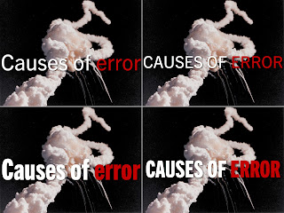
On this post I show to improve the text by using compress fonts and all caps text. I also show 2 variants to place white text over a white background. I obviously like to doing slides. So after an in intense last weeks of doing non-photographic ones, I was in the mood today to experiment. Some context, I was watching the New York Times' dining section videos, which have a strong typography and after some minutes I fired up Keynote and started to play with serif fonts It didn't take long to open Wiki-Media's Picture Of The Day (POTD) collection, where I found a picture of the 1986 Challenger disaster. The picture serves as an analogy of things that can go wrong. I cropped it to an aspect ratio of 4:3, scale it to 1024 × 768 so inserted it into a slide. That makes a full-bleed slide, but I also wanted to add some text: Causes of error. Here are 4 variants of the same image and same text: I like the bottom right better.  Although all 4 use the same Trade Gothic typefa

How to make your own Keynote template

Image
You probably know I hate presentation templates. However in last couple of months I have found myself not only using them, but creating them, I have been blown away with what  I have been able to achieve. There is a caveat, my own templates have only one master slide, and it is a blank one. That is all you actually need from a template: one single blank master slide. There are 3 things that blank slide has. A font family, like Roboto. A background color. A color palette. Here is an example: I like Roboto for 3 reasons: It is free, it is professional, and it has enough styles and glyphs. I have been starting to use Keynote's Color Palette just a few week and it has helped me speed out my work and keep my work consistent.  Mini-tutorial 1. Getting down to only 1 master Slide 1.  Let's start from with a default template, say "White".  2. Click on Show Master Slides. 3. I have added the Rule of Thirds to my white template for better placeme

How to improve slide titles

The titles (if any) of your slides, are most likely to be dead. They don't communicate. They aren't memorable. They don't stick. But don't despair, there is a better, scientifically proven way: Assertation-Evidence driven slide title—a concise, complete sentence headline (no longer than 2 lines). The following video shows an  example of this type of slide design You can find more information of Assertation-Evidence slide design at PennState here . The key word is headline . Getting an appropriate, memorable, sticky, and concise headline is not easy. Fortunately there is enough inspiration coming from the news.  Here is an example. Granted, these are not scientific, but they do show their basic language structure . All in all, Assertation-Evidence slide design is thought to improve the quality of a presentation. Though is it hard work, the outcome is worth the effort and inspiration is also everywhere.

A scientific approach to scientific talks

 It is paradoxical that some scientists approach teaching in a anecdotal way, rather than in a scientific way. I'm paraphrasing Harvard Physics professor Eric Mazur. Garr Reynolds has written a couple of very interesting post about presentation and education in the 21st century , that include a talk from Mr. Mazur. By a scientific approach to presentation I mean two things. First, the use and application of the theory of the psychology of a presentation: How people think and learn, how to grab and hold people's attention, ans how people listen and see. 5 Things Every Presenter Needs To Know About People from Weinschenk on Vimeo . The second thing is to measure how efficient a presentation is. It seems natural that if the scientific method is based on measurements, the outcome of a scientific presentation would also be measured. I have never heard or attend a scientific conference where the audience evaluates talks, or give feedback. That was exactly this measurement t

Visual examples: Creating a visual representation

Image
It feels odd to write this post. In fact it feels odd to write about pretty slides, when the power of a talk doesn't come from them. However, memorable visuals help the audience understand better and remember longer. That's why visual storytelling matters so much in presentations. Science tells us that stories is a great way to learn, then makes perfect sense that scientists use stories in their scientific presentations. In fact, as most people are visual learners it makes sense to know and apply visual storytelling to presentations. So here is the story of today's post. Some months ago I worked on a stack of visuals, which involved representing that a certain oral test is a bridge between education and professional life . After having found an appropriate image (Puente de Alcántara, Toledo Spain) and the talk's rehearsal. I came with a decent slide, that got noticed by the audience. If some more time in my hands, I tinkered a bit more and came up with this: Thi

Presentation guru: Nick Morgan

Image
Nicholas H. Morgan, Ph.D. No, in fact Dr. Nicholas Morgan is not a presentation guru, he's a presentation Jedi Master. His book Give your speech, change the word is considered —among experts in public speaking— one of the best.  What I mostly treasure about his book is PART III. Rehearsing the presentation . Most presentations suck because of their lack of preparation and feedback. Not only his book, but also his blog is amazing. Dr. Morgan's stand in Slideware is that the best slideware, is not slideware at all. He views communication as leadership, which to I completely relate to, because I believe that scientists ought to be leaders. By the way, wanna know what other books experts consider worth the time? The Top 35 Books on Presentations from Gonzalo Alvarez Image credits: Nicholas Morgan by nfrodom1 under CC BY 2.0 license.

Visual examples: The Good, the Bad and the Ugly of Obama's State of the Union speech 2013

Image
It is February, time for the SOTU( State Of The Union) address and like in past years I have looked at the slides of the enhanced speech. The major why this matters to scientific presentations is because of the data visualization they provide to the public.  The National Public Radio did a piece on this and ask Steve Few author of Show me the numbers, and Nathan Yau of flowing data about the quality of charts. According to Mr. Few and Mr. Yau for the most part Obama's team did a good job. There were however some cases the criticized.  Here are 4 of them. Call it The Bad . You can click on them to see a larger version. whitehouse.gov 12 Of The Hottest Years On Record  misplaces the x-axis by not setting it at 0. This creates an unnecessary dramatic effect. The y-axis has no units and the labels on the same axis should be "-0.4", "-0.2", … to emphasize these are rational and not integers numbers.   Natural Gas Wells doesn't tell the whole story with t

Wanna give a better presentation? Well, start editing!

Image
No big news, no breaking news. This is a classic: Edit your presentation. When I see people preparing their talks for the next day, I wonder how do they edit? How do they get feedback? A presentation should be written down. No to be read aloud, or to make a Powerpoint transcript of it, but to be used as a script. I mean, after all comedians also write their stuff . It doesn't have to be a book or prose. It can be a list of bullet points following a logical sequence. Still, edit that script. Get rid of everything that the audience doesn't care about.  Don't open your favorite slideware before you have written and edited your script. There. Now you have a better presentation. Image credit : Inauguration designed by Filippo Camedda from The Noun Project.

What the font?! – A great typography education resource

Image
I know I blogged yesterday, but this is way too important, at least to me. Yesterday evening I found an awesome educational resource on typography: FontShop Education . The content is excellent. It includes a glossary on typography, how to choose a type, "typo tips" from the renown german typographer Erik Spiekermann, and Meet your type. A field guide to typography.

Visuals example: 3 ideas for the outline slide

Image
Last week I bought Numbers in Graphic Design by Roger Fawcett-Tang and it inspired this post.  In my experience the easiest way to start using pictures in slides is by using them to signalize the beginning of a new section. If the right name is chosen, the right picture might follow easy.  This is a creative task, and it needs time, specially if it is the first time it is done.  So let's say you have the names and the images. Now to the outline slide. First things first, do not put "Introduction" or "Motivation" on that outline, it conveys 0 (zero, null, cero) information. The same thing goes for "Conclusions".  Another thing specially for those LaTeX/Beamer users, subsubsection (aka nested bullet  points) in the outline, are you kidding me? You are killing your audience right at the start of your presentation. Who's going to remember that? The first example is a straight enumeration, to give a clue of the images I masks the section images wit

How to do math slides with LaTeX and Scribus – and not with Beamer

Image
Yeah, I keep (really) hating  LaTeX/Beamer. Thankfully, there is a better way to make slides with LaTeX on a WYSIWYG software. It is Scribus running LaTeX as a external tool. Here is how to get started. Yesterday I got a comment from wipeout on a remix of a math presentation I did in 2011. He asked if it could be done all in Beamer. I did research and ended writing this post. I have been using LaTeX for more than 10 years. It is a beautiful tool to typeset beautiful math. But LaTeX is neither a word processor, a desktop publishing tool, nor slideware. In words of its creator Producing good slides requires visual formatting, which means LaTeX is not well suited for the task.                                                                        – Leslie Lamport LaTeX/Beamer doesn't create the visuals you need , but rather the ones it can . It limits your control of at least 3 things: Positing, Alignment, and Color. Oh and add Imagery to it. Speaking of design elements, I get

Wanna rock an audience? Be you!

It is easy to get lost and think that pretty slides take for a better talk. They don't. What makes a good scientific talk, at least to me anyway, is that sense of awe – "Wow, it is really possible?!" – that a carefully crafted and rehearsed message (stories, explanations, open questions, problems, meaning, …) awakes in the audience. To create that awe one has to be honest, open, naked, true to oneself, or however you want to call it. Case in point, Supermodel Cameron Russell's TED talk. Enjoy!

Improve your slides now!

Image
There is one thing you can do right now that will boost your slides: reduce the number of words per slide. It is that simple. By reducing the number of words you make your audience happier because first, you'll naturally increase the font size of the text, and second you will stop reading your slides even start looking at your audience. The fastest way to reduce the number of words in a slide is by splitting its content into several slides. There is no country in the world with a slide tax, so don't worry if you end up with 3 or 4 times more slides. This might even be good, for it might help scoop the unnecessary detail. Split the content until you have one idea per slide, in other words make your slides atomic. After you have done this, use 6 or less words but no bullet points! Remember that you don't need full sentences, but just enough text to communicate that atomic idea.  Light Bulb designed by Shane David Kenna from The Noun Project

Animate SVG with the help of Inkscape

Image
Sources: wiki.inkscape.org upload.wikimedia.org  I feel guilty. I know, I shouldn't be writing about animations. But now again, knowing the available tools it is an integral part of making good presentations. After all, I know people who still draw their diagrams on PowerPoint. I'm going to pass that and assume you have opened Inkscape and know what SVG means. If you don't, google those two words "SVG" and "Inkscape". It will blow your mind, that is, if you're still using PowerPoint or alike to do your diagrams. Do you wish you could animate the diagrams you have made using SVG? I have news for you. You can, but it is painstaking. The keyword is SMIL (Synchronized Multimedia Integration Language), and with the help of Inkscape , some inspiration and patience you can get nifty results. A couple comments. Some browsers, like Firefox, can display SVG. This is important because slideware will necessarily support this format. So you have at lea