Visuals example: 3 ideas for the outline slide
Last week I bought Numbers in Graphic Design by Roger Fawcett-Tang and it inspired this post. In my experience the easiest way to start using pictures in slides is by using them to signalize the beginning of a new section. If the right name is chosen, the right picture might follow easy. This is a creative task, and it needs time, specially if it is the first time it is done. So let's say you have the names and the images. Now to the outline slide.
First things first, do not put "Introduction" or "Motivation" on that outline, it conveys 0 (zero, null, cero) information. The same thing goes for "Conclusions". Another thing specially for those LaTeX/Beamer users, subsubsection (aka nested bullet points) in the outline, are you kidding me? You are killing your audience right at the start of your presentation. Who's going to remember that?
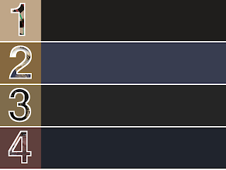
The first example is a straight enumeration, to give a clue of the images I masks the section images with the numbers. After I finished it, I didn't like it. The images don't pop-up, there is a nuance though, that I thought could create a sense of mystery. The color scheme is also a bit of a mess. It looked as if I couldn't make out my mind. But of a bit of patience and tinkering the appropriate color scheme can be found.
 Here is an improved version. This is much clearer. The images are cropped to squares (and aligned) and the shades of grey convey a sense of motion. I really like this one. Note that all the text is in upper case.

Finally, what if I want to go for only squares and there are only 3 real sections? This slides is inspired (shall I say stolen) from the work of Emiland de Cubber. Maximize images, minimize words.
 I hope these 3 examples can get you some inspiration.
Image credits (all images taken from Wiki Commons):

First things first, do not put "Introduction" or "Motivation" on that outline, it conveys 0 (zero, null, cero) information. The same thing goes for "Conclusions". Another thing specially for those LaTeX/Beamer users, subsubsection (aka nested bullet points) in the outline, are you kidding me? You are killing your audience right at the start of your presentation. Who's going to remember that?
The first example is a straight enumeration, to give a clue of the images I masks the section images with the numbers. After I finished it, I didn't like it. The images don't pop-up, there is a nuance though, that I thought could create a sense of mystery. The color scheme is also a bit of a mess. It looked as if I couldn't make out my mind. But of a bit of patience and tinkering the appropriate color scheme can be found.


Finally, what if I want to go for only squares and there are only 3 real sections? This slides is inspired (shall I say stolen) from the work of Emiland de Cubber. Maximize images, minimize words.

Image credits (all images taken from Wiki Commons):
- Bullseye photo by Christian Gidlöf licensed under GNU Free Documentation License
- Volcano photo by Nasa licensed under CC 2.0 Attribution-Share Alike
- NYC photo by Paulo Barcellos Jr. licensed under CC 2.0 Attribution-Share Alike
- Woman photo by Luca Galuzzi licensed under CC 2.5 Attribution-Share Alike


Comments
Post a Comment