Posts

Showing posts from June, 2011

Presentation Gurus: Richard Feynman

Image
Last week I showed you an example of using photographs as visuals. Actually the last couple of posts have been heavy on my own examples. Let's change that by introducing a real guru on scientific presentations. Meet physicists Richard Feynman. Feynman was a great presenter who didn't live to meet the PowerPoint generation. I was able to find this on YouTube.  Enjoy!

Visual examples: using photos as visuals

Image
In this post I give an example of how photos can be used in a presentation's visuals. I show one more example of image manipulation and how to use the power of analogy to produce beautiful visuals.  I'm helping a friend creating a presentation stack for a talk about an exchange program between a university here in Germany and the Universidade de Sao Paulo in Brazil. Strictly speaking this is not a scientific presentation, but it will take place in a university context. The audience is made of potential students that would take part on the program exchange. After gathering the important facts, I went to Wikipedia and Fickr to pull some images. All the images have a creative commons license.  Here are some examples: To start, Sao Paulo. I pulled this panorama of old downtown Sao Paulo from Wikipedia. The original is larger than the size of canvas. Instead of trying to scale it or crop it to make it fill in one slide, I animated it in Keynote by moving from right to left.

A word on visuals: Two photo tricks

Image
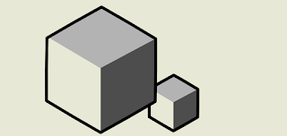
Scientific presentations can profit  from cinematographic storytelling, specially from those effects that direct the eye gaze. In this post I present the vignetting and background blur effects. They are quick to prepare and yield great results.      If you are including photographs in your presentation there are two classic tricks to help to direct the attention of the view to exactly what you what. The tricks are called vignetting and background blur. You might already know what I'm talking about. The tricks are used in movies like The Graduate (1967) and Citizen Kane .  To show the first effect I created an artificial image using Inkscape. Original   Vignette . According to Wikipedia vignetting is a reduction of an image's brightness or saturation at the periphery compared to the image center . Vignetting helps directing the viewer into your slide. You can create this effect using the GIMP of Photoshop. Basically you just make an oval selection around the object of in

Visual examples: remixing a math presentation

Designing math visuals is tough because of the level of abstraction. In this visual example I remix 5 slides of a math presentation.  I illustrate a way around the level of abstraction and show how to reduce to information per slide. In the past couple of days I have been working on remixing some slides of a math presentation. It is a project I have been wanting to do for a long time, and I'm happy I finally did it! The original presentation is called A short course on: Preconditioned Krylov subspace methods by Yousef Saad. You can download the presentation here .  Don't let the title scare you! Understanding the content is not important in this case.  I encourage you to download the original slides and compare them with the remix below. I've chosen this presentation for three reasons. First, it is a classic example of average visuals in scientific talks. Second, I know the topic, so I could be sure I knew how to remix it without making (hopefully) content mistakes. Th