Posts

Showing posts with the label Typography

Missing Serif

Image
 What do you read here?    Is it (El, one, one) or (El, el, one)? What if this was part of your password and you just don't know what the f*ck it is? Enter (mosty) sans serif.  This is case where Serif types are better suited than their sans counterpart. This is my case to paying attention to what is actually in front of you while you are designing. And my case for password manager software to use Serif types when displaying a password.  Rendered on Serif reveals the mistery: Do not discard Serif types in your stack of visuals!

How to create a drop cap in Keynote

Image
  Following the last posts on text. I want to talk about drop caps. You have seen them in magazines and ancient books. They're cool and they can be done in Keynote but there is a caveat. If need to put your text in a shape and getting to the settings in to that simple. Let's take a look:  Next, put your text inside the shape and format it as you want. Then select the Initial letter and open the format side panel (#1): All the way down you'll find the drop cap (#4). It is not intuitive to get there. So note that it in under Text(#2) and Style(#3). If you don't see it, double check that the initial letter is selected. Now, you can apply it (#2): I have chosen a predefined drop cap style (#3) and modified the font (#4a) and its color ($4b).  This is the end result:  

How to choice and download fonts using Google Fonts

Image
When it comes to choose and download fonts for either PC or Mac two sites come to my mind: dafont and font squirrel. However, I don't like them. They are more worry about themselves than with the content they provide.  And there is Google Fonts (or GF, for short).  I used to hate this site because I could not find how to download their fonts easily. But recently, Google Fonts (GF) got a facelift, and I really enjoy using it now.  All fonts in Google Fonts (GF) are open source and free. Right now there collection has about 800 items. It might seemed difficult to choose from such a big collection, but  GF offers some tools to help us narrowing down our options. Custom Text Ok, this is nothing new, but what I really like is that you can with a single click set the custom text to all items in the list. Search for number of styles, width and languages The search navigation allows not only to filter for Category and sort by date, popularity and trending, but i...

How to improve the text on a slide

Image
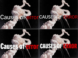
On this post I show to improve the text by using compress fonts and all caps text. I also show 2 variants to place white text over a white background. I obviously like to doing slides. So after an in intense last weeks of doing non-photographic ones, I was in the mood today to experiment. Some context, I was watching the New York Times' dining section videos, which have a strong typography and after some minutes I fired up Keynote and started to play with serif fonts It didn't take long to open Wiki-Media's Picture Of The Day (POTD) collection, where I found a picture of the 1986 Challenger disaster. The picture serves as an analogy of things that can go wrong. I cropped it to an aspect ratio of 4:3, scale it to 1024 × 768 so inserted it into a slide. That makes a full-bleed slide, but I also wanted to add some text: Causes of error. Here are 4 variants of the same image and same text: I like the bottom right better.  Although all 4 use the same Trade Gothic typefa...

What the font?! – A great typography education resource

Image
I know I blogged yesterday, but this is way too important, at least to me. Yesterday evening I found an awesome educational resource on typography: FontShop Education . The content is excellent. It includes a glossary on typography, how to choose a type, "typo tips" from the renown german typographer Erik Spiekermann, and Meet your type. A field guide to typography.

A word on visuals: Typography

Image
Source Wikipedia under CC license by Brandenands I have always been hesitant to write about typography because I have no formal education on it. However I can't keep quiet after what I have read and seen last week. Last week I found Emiland De Cubber .  He describes himself as a "full-time presentation lover and a part-time presentation designer." Certainly, Emiland's visual stacks stand out, but I disagree with his advise on typography and how he uses it. Now, I know I'm nobody in the Slideshare /presentation world, neither do I want or pretend to be.  I also know that in graphic design there is an entire world of styles. But I also know that design should be One and Universal, and that respecting the audience also means offering them type they can easily read.  So here is can I think about typography.  One single typeface is enough for one presentation stack I'm with Seth Godin in that a slide shouldn't have more than 6 (six) words,...