Posts

Showing posts with the label a word on visuals

Missing Serif

Image
 What do you read here?    Is it (El, one, one) or (El, el, one)? What if this was part of your password and you just don't know what the f*ck it is? Enter (mosty) sans serif.  This is case where Serif types are better suited than their sans counterpart. This is my case to paying attention to what is actually in front of you while you are designing. And my case for password manager software to use Serif types when displaying a password.  Rendered on Serif reveals the mistery: Do not discard Serif types in your stack of visuals!

A word visuals: sometimes more is simply more

Image
A mantra of design is  Less is more  which does not preclude that more isn't more, but in fact this mantra is used to drive the use of less. This post is about that sometimes more is better than less. Let me explain, This title slide is with no doubt a lot So, following the above mentioned mantra, I tried to reduce the amount of ink by changing the background to a softer one: but then this happened:  I like the first one better. The feeling that it invokes is a more fun, sunnier, summery wave. The second one is … hollow. But here is another example in the opposite direction:   In this case less is indeed more. The morale of this exercise is to iterate and try at least one entirely different variant of an important element. Call it exploring the design space if you want.

A word on visuals: An alternative to the bullseye diagram

Image
A particular type of diagram that I often have problem with is the bullseye diagram. Bullseye diagram The problem is text placement. Some people, including me, opt to place the text outside the diagram and connect to it using lines or arrows. A bullseye diagram conveys the idea of a core and its subsequent layers. It is a hierarchy diagram with the center been the most important part, the core if you will. A slide that I didn't show in the last post was a simplification of diagram I would called a Earth's Layers diagram: Source: Wikimedia Commons In essence, it is the bullseye diagram in 3D. I wanted to visualise the following layered hierarchy 1. Principles 2. Methodologies 3. Tools. At the core are the principles, followed by the methodologies, and tools as the final layer. My plan was to place the text on x-y plane. I ended up not using the earth's layers diagram because I couldn't modified the above diagram to have only three layers. So  instead I c...

A word on visuals: Redrawing a diagram

Image
Scientist and engineers need diagrams to express ideas, and so they make it into a presentation's visual stack. Some caution is necessary when inserting diagrams into a presentation's visual stack.  Some could come in the form of a scanned document, some could come from a cropped pdf, or a image file. Biology Professor Zen Faulkes  has also written about the topic of redrawing here . Here is an example of a diagram that needs to be redrawn: If I would have inserted this diagram as it is there would  have been several problems, including Not all text would have been legible.  The diagram would have included information the audience doesn't need. The diagram might have looked pixelated. In other words, I would have lost control over it. I can recover the control by redrawing the diagram. Nowadays it is fairly easy to do this. High quality SVG maps are released under public domain or Commons Creative licenses. Plus, open source for manipulating vector graphic...

A word on visuals: Transitions

Image
There are many lessons to learn from films, such as story-boarding, visual composition, and editing. Here is a quick trick to make your visuals moving forward through your talk. The trick is called "wiping" and in it you move from slide "A" to slide "Z" by wiping "A" with "Z", like this: The line between the two slide is meant to give a connection between them.  The connecting element is important it provides continuity.  This simple scene is made of two main elements: The transition itself and the connecting line.  Let me show you the details. 1.  The transition.  Although it looks like Z wipes A, The transition is done in A, it is called "Push" and it is done from right to left.  2.  The lines. Moving A from right to left and connecting it with Z means that the line is at A has to at least go to very end of the slide, in this case the slides are 1024×768 are therefore the line goes up to 1024. To keep the continuity,...

Comparing Obama's State of the Union address slides 2011 and 2012

Yesterday I watched this year's President Obama State of the Union address. Obama is a great public speaker and many books have been written about this, but that's not what I want to write about today. What stroke me this time was, that the visuals of the enhanced presentation, where not as good of the visuals from last year. So I went to slideshare.net to compare them, and I was right. The visuals from 2011 are superb! In 2012 the slides couldn't hold one concept, and because Unity is perhaps the tenet of graphical design, I wanted to share them here.  You can draw your own conclusions. The moral of this tale for me is that even pros have bad days.  2011 Enhanced State of the Union Address Graphics   State of the Union - Enhanced Graphics

A word on visuals: Using text in slides part II

Image
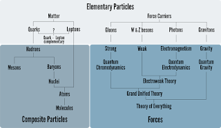
In part I I talked about the shape of the text in slides. In part II I want to address the content. There are two basic questions. One is, when is the use of words better than the use of pictures? And the other, how to effectively use words in pictures? Let me kick off with the diagram below that I found in Wikipedia and remixed. On question that putting the information shown here into a written form would take more time to process. This is the point that the director of the Data Visualization at the University of New Hampshire, Colin Ware, makes. According to Mr. Ware, hierarchical relationships are most effective presented in a structured diagram (Graphics 1, Text 0). Now take a look at the diagram below. It is called a flowchart, and it is used to graphical display an algorithm. In this case computing the factorial of n, n!. In case you wonder n! = 1 x 2 x ... x n. The pseudocode of this flowchart would be something like this:  read n f = 1, m = 1 mark: f = f*m if(...

A word on visuals: Using text in slides part I

Image
The use of text in slides is overused, almost abused. In this post I go through two useful principles to improve the use of text in your slides, namely the 6-words-per-slide and 10-20-30 principles.    There is a lot to say about the use of text in a presentation deck, but this is for sure: Minimize the number of words per slide. In this e-book Really Bad PowerPoint,  Seth Godin suggests to use a maximum of 6 words. In the clip below, former Apple Chief Evangelist Guy Kawasaki talks about his 10-20-30 principle. The 30 stands for 30pt (pt = point) as the minimum font size in a slide. To make this rule more precise take a look at the image below. Both sentences are written in 36pt, but one sentence is bigger than the other one (click on the image to enlarge.) Conclusion? Not only does size matter, also type matters (no pun intended!) John McWade from Before&After Magazine  suggests to look for types that contain simple lines have large counters and wide ...