Posts

How to add rounded corners to any shape in Inkscape
Image
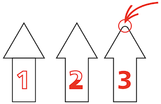
  Heads-up! Directly inserting svg files in Keynote is now possible, albeit limited editing possibilities.  One of the things I struggled for years was to create rounded corners in shapes, until yesterday when I, thanks to Nick Sapurito's Inkscape Master Class,  learned about the Live Path Effect (LPE) called Corners. I have known about LPE for years, but always ignored until two months ago, when I had to bend text. Anyhow… Quick tutorial This is my starting point, an arrow with sharp edges: 0. Select the shape you want to apply the arounded corners. 1. Open the Live Path Effects dialog  by going to the Path Menu > Path Effects … Don't ask me why people write and talked about Live Path Effects, but in inkspace is simply called Path Effects. Also note it has a direct shortcut. 2. This is inconvential, but I searched for the effect instead of directly clicking on it, just to keep you  focused: 3. As the next figure shows, this effect allows to add (or not) a corner to every

Missing Serif

Image
 What do you read here?    Is it (El, one, one) or (El, el, one)? What if this was part of your password and you just don't know what the f*ck it is? Enter (mosty) sans serif.  This is case where Serif types are better suited than their sans counterpart. This is my case to paying attention to what is actually in front of you while you are designing. And my case for password manager software to use Serif types when displaying a password.  Rendered on Serif reveals the mistery: Do not discard Serif types in your stack of visuals!

Use presenter notes in Keynote without an external monitor

Image
 If you use Apple Keynote' presenter notes you might not know that you don't need an 2nd monitor to use them. Since Apple broke using an external display in macos 11.6.1 on my iMac 2015,  I had to look for an alternative to use Zoom and presenter notes in a single Monitor. The solution comes in the form of using Keynote's In Window Play and sharing only the Keynote Window in Zoom. I'll only address the Keynote part in this post. So you have a presentation with presenter notes  If you look at Menu > Play, it might look like this For me, this has always been the standard configuration. If instead you choose In Window and press Play Keynore will render this   If no presenter notes are shown, click on Show Presenter Display in Window.

Text that moves on the page

Image
  No, I'm not talking about transactions or animations. I'm talking about graphics design.  This is dynamic text. So if you are thinking about visualizating a counter, here is a posibility.

How to multi color a shape in Keynote

Image
  I recorded this some weeks ago. Applying an advanced gradient filling to a shape in Keynote has its pros and cons, but for irregular shapes it might be very useful.

How to choose the second (sans serif) font

Image
  The text above is made of two different fonts: Teko and Open Sans, both sans serif. They work together because they are very different, i.e. the contrast is significant. Take a look at the details above. The clear difference is found in the a and g, but such subtle in the e and s: The stroke at the end of the e and s, the terminal, is different. So is the main stroke of the s, the spine. Even more subtle contrast is the bowl or curvature of the o, and the dot of the i's. While one is a rectangle, the other is an oval, which brings me to the topic of contrast in the shape: The more pronounced the curve, the softer a shape is perceived. Traditionally, banks and law firms logos and fonts are serif and the strokes a straight rather that curve, obviously there are exceptions, especially with generational changes. Consider the shape of a font and it's emotional relationship to the subject your presenting. Education might hold a very playful font like comic sans (yes, come after m