How to improve slides
In her book "Resonance" Nancy Duarte writes about "killing your darlings" meaning that some times you have to discard some of your most beloved work and ideas in favor of better presentation. In some cases, you have to throw all the work and start all over. Yes, it is a radical step. I would suggest weighting-in how meaningful the ging is before taking that step. Needless to say, I started working on design four weeks before the presentation and at the end I was tired. But the colleague I shared the stage with did a very good job. So yeah, so much work paid off.
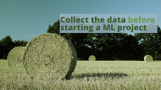


In this post I'll be talking about the process of discarding ideas and how iterating helps you achieve a better product. The first round was photography based. You have been seen before:
- Full width

- Single Element

- Image bullets

- Double spread

Before we go on, one technical detail. The format is not longer 1024x 768 px (4:3) but 1920x1080 px (16:9). It gives a more cinematographic feeling. Good bye 4:3!
Although there is a style in here, it isn't tight. I really like the Full width and single element shown here, but in general the style isn't unified. But there isn't a theme either. Nature, guns, food, space... hmm space:
- Rework on the image bullets. The people in the NASA picture weren't us!

- Rework on the "Bread & Butter" idea

In "pre-production" Carina discussed the sound bite of the role of data in machine learning (ML). I suggested "Data is the (s)oil" shamelessly stealing it from David McCandless's Ted Talk "The beauty of data visualization", and Carina suggested "Bread and Butter". After she and I agreed of the space theme, the idea "Data is the fuel of ML" which came out very naturally. In case you don't know the space shuttle had a massive orange fuel tank attached to it.
We ended up in a space/fuel/energy theme and an orange icon style: Tight and Neat!
- First slice in the deck

- Data extraction analogy I

- Data extraction analogy II

- Energy analogy

We also include a quote which fitted very well in the style.
- Scan of book cover turned to svg to keep the color palette

The credits of the Common Creative Icons went into a single slide.


Comments
Post a Comment