Posts

Showing posts with the label Before and After Magazine

Minitutorial: Creating a title slide from a portrait image
Image
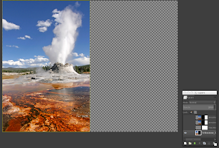
Back in January I promised I would do a tutorial on how to turn a portrait image into a full side slide. Well I can't start a series on tables without first doing that tutorial. Let's get started. The "problem" is simple, you have an image with the right height of a slide, the the width is not enough. In the case of a 1024 × 768 slide, some images come in the 512 × 768 size, so what to do with the other half? Case in point, Figure 1: Original portrait image. I would like to use this image taken from Wikimedia commons, but what to do with the other half? The result that I what to go is this Figure 2: turning Figure 1 into a full side slide With would give me white space and a sense of continuity that I really like. SO that's what we are going to do,  makeover Figure 1 into Figure 2.  The trick is simple, (1) we crop some pixels from Figure's 1 right border,  (2) stretch it to cover the rest of slide, and (3) blur it.  There is pre-processing and s...

A word on visuals: Typography

Image
Source Wikipedia under CC license by Brandenands I have always been hesitant to write about typography because I have no formal education on it. However I can't keep quiet after what I have read and seen last week. Last week I found Emiland De Cubber .  He describes himself as a "full-time presentation lover and a part-time presentation designer." Certainly, Emiland's visual stacks stand out, but I disagree with his advise on typography and how he uses it. Now, I know I'm nobody in the Slideshare /presentation world, neither do I want or pretend to be.  I also know that in graphic design there is an entire world of styles. But I also know that design should be One and Universal, and that respecting the audience also means offering them type they can easily read.  So here is can I think about typography.  One single typeface is enough for one presentation stack I'm with Seth Godin in that a slide shouldn't have more than 6 (six) words,...

Visual examples: Creating title slide using a portrait photo

Image
After yesterday's post, this morning I played with the red wolf's image a little bit more. For some time I found it challenging to use an image that fills the height but not the width of the screen I call this a portrait photo. But recently, going through Before & After Magazine's Master Collection,  I found a trick to leverage a slide that contains this portrait mode images. So this morning I applied the trick to the wolf's image, and I was so impressed by the result, that I decided to share it. I'll be doing a full tutorial on this in the coming weeks. The trick is to copy a 20 pixel wide stripe from top to bottom of the image's left, right side (or both) border, stretch the strip or strips to fill the space, and then strongly blur it. With this trick, you can create a nice looking title slide. As I said, I was pretty satisfy with mine.

Inside great presentations

Last night I was reading Before & After Magazine issue number 3. Their column "The thinking designer" was about what to look for (what to strive for) in good advertisement, but it could as well be applied to great (scientific) presentations: Their message is a surprise. They don't lose clarity. They involve the audience. They challenge curiosity.   They command answers. They let the audience think. They're always well executed. The "curiosity challenge" is also expressed in this quote from filmmaker Sheila Curran Bernard about documentaries At its best, documentaries [in our case scientific presentations] should do more than help viewers pass the time [or information]; they should demand their active engagement, challenging them to think about what they know, how they how it, and want more they want to learn. —Sheila Bernard Author of "Documentary Storytelling"