Posts

Showing posts with the label examples

Text that moves on the page

Image
  No, I'm not talking about transactions or animations. I'm talking about graphics design.  This is dynamic text. So if you are thinking about visualizating a counter, here is a posibility.

Visual Examples: Principles and Smells

Image
Yeah, I'm back.  These are sample visuals for a coming presentation on some basics of software development target for a none technical audience. Commons The background is a linear gradient from #DFDFDF to #FFFFFF with no transparency, and except for the images, the only colors are orange ( #EB9D3F ) and blue ( #3B85A7 ). The font is Open Sans, which I like more and more. As with as Roboto it is was commissioned by Google and is free. Images The images are from Wikimedia Commons, some of them are either Feature Images of Quality Images. I had to desaturate them in order to gain control back of the overall aesthetics. #1 Principles Principles slide with layout number 1 #2 Smells Smells refer to problems caused when one doesn't follow the principles.  I purposely changed the layout to reflect this. Smells slide with layout number 2 As an exercise I did the smells slide with the principles layout number 1… Smells slide redone with layout number 1...

A word on visuals: Redrawing a diagram

Image
Scientist and engineers need diagrams to express ideas, and so they make it into a presentation's visual stack. Some caution is necessary when inserting diagrams into a presentation's visual stack.  Some could come in the form of a scanned document, some could come from a cropped pdf, or a image file. Biology Professor Zen Faulkes  has also written about the topic of redrawing here . Here is an example of a diagram that needs to be redrawn: If I would have inserted this diagram as it is there would  have been several problems, including Not all text would have been legible.  The diagram would have included information the audience doesn't need. The diagram might have looked pixelated. In other words, I would have lost control over it. I can recover the control by redrawing the diagram. Nowadays it is fairly easy to do this. High quality SVG maps are released under public domain or Commons Creative licenses. Plus, open source for manipulating vector graphic...

How to improve the text on a slide

Image
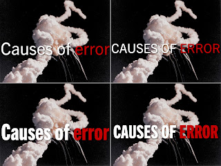
On this post I show to improve the text by using compress fonts and all caps text. I also show 2 variants to place white text over a white background. I obviously like to doing slides. So after an in intense last weeks of doing non-photographic ones, I was in the mood today to experiment. Some context, I was watching the New York Times' dining section videos, which have a strong typography and after some minutes I fired up Keynote and started to play with serif fonts It didn't take long to open Wiki-Media's Picture Of The Day (POTD) collection, where I found a picture of the 1986 Challenger disaster. The picture serves as an analogy of things that can go wrong. I cropped it to an aspect ratio of 4:3, scale it to 1024 × 768 so inserted it into a slide. That makes a full-bleed slide, but I also wanted to add some text: Causes of error. Here are 4 variants of the same image and same text: I like the bottom right better.  Although all 4 use the same Trade Gothic typefa...

Visuals example: 3 ideas for the outline slide

Image
Last week I bought Numbers in Graphic Design by Roger Fawcett-Tang and it inspired this post.  In my experience the easiest way to start using pictures in slides is by using them to signalize the beginning of a new section. If the right name is chosen, the right picture might follow easy.  This is a creative task, and it needs time, specially if it is the first time it is done.  So let's say you have the names and the images. Now to the outline slide. First things first, do not put "Introduction" or "Motivation" on that outline, it conveys 0 (zero, null, cero) information. The same thing goes for "Conclusions".  Another thing specially for those LaTeX/Beamer users, subsubsection (aka nested bullet  points) in the outline, are you kidding me? You are killing your audience right at the start of your presentation. Who's going to remember that? The first example is a straight enumeration, to give a clue of the images I masks the section images wit...

"What are the important numbers here?" — How to improve tables. Part 1

Image
The presentation of data in tables is a usual practice in scientific talks. Sadly, most tables are ineffective. In this first installment, I give a n example of before and after table design.  Writing about tables is something I wanted to do for long time, after all quantitative data is at the heart of science and its communication. Tables are ubiquitous, and if you are like me, you learned how to design them by imitation. The problem is, most tables suck, as illustrated in this quote Getting information from a table is like extracting sunlight from a cucumber. — Farquhar & Farquhar, 1891 By the way, I got this quote from Wainer, H. (1992). Understanding graphs and tables. Educational Researche r, 21, 14-23, as well as the images below. Tables should communicate, but instead they are used as a dump of tabular data, which the audience is supposed to  navigate through, understand and make sense of. Oh yeah, all of that in a couple of minutes. Let's dive in. Be...


Visual examples: seeking for a concept

Image
You might remember professor's Jay Lehr 1985 article "Let there be stoning!" about the state of scientific talks. Inspired by it, I have been working on a slide stack about presentations . It is still work in-progress, but it has been a while since I posted some visuals, so here a sneak peek of it. Just a legal matter, all of the images under CC licenses and were taken either from Wikipedia or Flickr. The point of this example is to seek unity, a concept, among the slides. Keynote or PowerPoint templates provide a unity concept, at the expense of death by Powerpoint.  Getting to that unity has proved, at least for me, extremely difficult. Going through this stack makes me uncomfortable knowing that although there is similarity there is no unity. 

A good title visual makes a good first impression

Image
A good title slide helps you and your audience. In this post I give an example of how to build such title slide using Gimp.  After you have worked on the content of your talk, practiced it and got feedback, you might want to go for a great title slide. This slide helps the audience anticipate what kind of talk they will be listening to. The title of the talk, its author(s), and its(their) affiliation(s) are more than enough. Think about it, your audience how the name and date of the conference they are attending, why would you want to remind them about it? For me, the title of the talk is enough. Restraining to that amount of information helps to work on a great visual. So here is an example. The image below is from Wikipedia's Picture Of The Day (POTD) collection. Wikipedia's POTD January 1, 2012 Based on this awesome image I create this title slide. Let me walk you through how I got from this POTD to this title slide.  First, download the image in its full r...