Visual Examples: Principles and Smells
Yeah, I'm back. These are sample visuals for a coming presentation on some basics of software development target for a none technical audience.
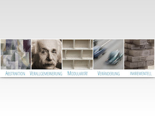
As an exercise I did the smells slide with the principles layout number 1…
but it doesn't have the punch layout number 2 has. I'm actually lying. The difference in the layouts is due to the number of items in each slide: 5 in Principles and 4 in Smells. The change in the layout does show the juxtaposition between principles and smells. For sake of completeness, here is the version of the principles slide with layout number 2:
Not cool. I think the problem is the quality of the inkrementell and Modularitaet images. Although the word Verallgemeinerung is very long and doesn't fix in the available space, I think one could get away with it. Note how layout number 1 is more benevolent in this regard. The Abstraktion and Veraenderung thumbnails look great on the layout number 2. But I decided to stick to the first one. I get the contrast between Principles and Smells for free with two different layouts.
Commons
The background is a linear gradient from #DFDFDF to #FFFFFF with no transparency, and except for the images, the only colors are orange (#EB9D3F) and blue (#3B85A7). The font is Open Sans, which I like more and more. As with as Roboto it is was commissioned by Google and is free.Images
The images are from Wikimedia Commons, some of them are either Feature Images of Quality Images. I had to desaturate them in order to gain control back of the overall aesthetics.
#1 Principles
 | |
|
#2 Smells
Smells refer to problems caused when one doesn't follow the principles. I purposely changed the layout to reflect this.
 |
| Smells slide with layout number 2 |
 |
| Smells slide redone with layout number 1 |
 |
| Principles slide with layout number 2 |
Not cool. I think the problem is the quality of the inkrementell and Modularitaet images. Although the word Verallgemeinerung is very long and doesn't fix in the available space, I think one could get away with it. Note how layout number 1 is more benevolent in this regard. The Abstraktion and Veraenderung thumbnails look great on the layout number 2. But I decided to stick to the first one. I get the contrast between Principles and Smells for free with two different layouts.
#3 SPA
Single Page Applications, or SPA for short, are websites that don't require a whole reload of a page. SPAs mimic the behavior of a traditional Desktop application. That why I contrast a Windows logo with a web browser.
You might be wondering why I rotate the title. After all it de-emphasises it and increments the cognitive load. Precisely because the title are just three words and only the last one has more than three syllables, it engages the viewer.
#4 Process
One difficulty in these slides was to find an icon for testing that wasn't icons of magnifying glasses or insects. This test icon is inspired on the Test Corps for the Google Tech Talks and pushing the idea of Corps in the military. If you look at the Insignias of the U.S. Army, you'll find the resemble.
A 7 Step process won't fix in a slide, that's why I broke it down into two slides with a fancy transition. Watch the video below!
Part 1
Part 2
Here is the process with the push from right to left transition.


Comments
Post a Comment