How to improve the text on a slide
On this post I show to improve the text by using compress fonts and all caps text. I also show 2 variants to place white text over a white background.
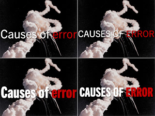
I obviously like to doing slides. So after an in intense last weeks of doing non-photographic ones, I was in the mood today to experiment. Some context, I was watching the New York Times' dining section videos, which have a strong typography and after some minutes I fired up Keynote and started to play with serif fontsIt didn't take long to open Wiki-Media's Picture Of The Day (POTD) collection, where I found a picture of the 1986 Challenger disaster. The picture serves as an analogy of things that can go wrong. I cropped it to an aspect ratio of 4:3, scale it to 1024 × 768 so inserted it into a slide. That makes a full-bleed slide, but I also wanted to add some text: Causes of error. Here are 4 variants of the same image and same text:
Compressed fonts are great space savers. Both slides on the top use Regular Trade Gothic. The top left text has a size of 156pt, the top right 118pt, meanwhile the bottom slides use Heavy Compress Trade Gothic has a size 170pt (right) and 209 (left).
Another question is the all caps text. For short title like this one, all caps is fine. Research shows* that the idea that all caps text is harder to read is a myth. A more important issue on readability is the white text over white background positioning. You don't necessarily have to change the text color to make your text readable. On the computer screen it might look fine to read the, but on the LCD projector it might not be readable. Here are 2 alternatives:
You can either give the text a shadow (middle) or you can place a semi-transparent black background underneath the text (right). Usually 30-40% opacity is a enough.
In conclusion
- Use fonts that have (heavy) compress variants. Roboto and League Gothic are 2 good free options. Play with available type variant and choose something you like.
- Don't shy away from using all caps in text.
- It is possible to use white text over white background


Comments
Post a Comment